It is a known fact that mobile technology is predominantly becoming a bigger part of our daily lives. Especially with the introduction of faster mobile networks such as EE. Therefore, both consumers and web visitors would have a need to view websites via their smartphones and tablets.
Consider this: More than 55% of all Internet usage is now via mobile devices. It is expected to overtake desktop browsing within 5 years. A cross-platform strategy is critical to the long term success of your WordPress website if you are to have any hope of competing in the future.
Since the invention of smartphones and iPads, a million screens bloomed which leaves web designers and WordPress theme developers having to build all types of layouts that is compatible with several devices that would improve navigation, user experience and call to action.
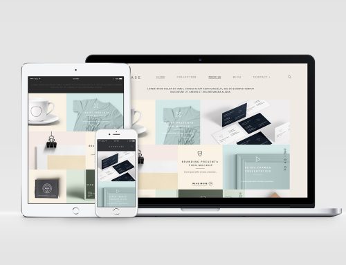
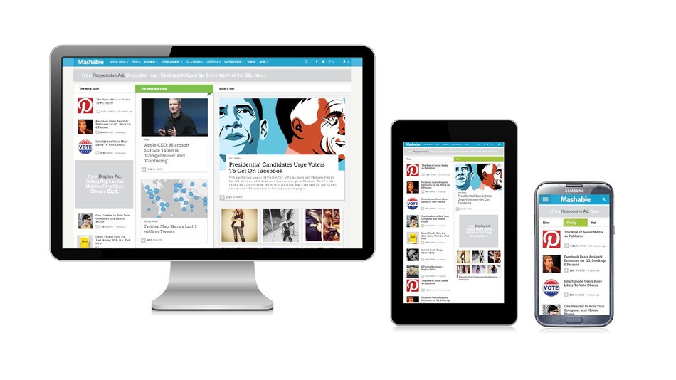
In a nutshell, responsive web design is all about having one website that works seamlessly across all tablets, mobile devices and traditional desktop computers. This allows users to have a great experience with your content in a readable way.
Without getting too technical, responsive web design uses web coding elements like CSS queries to figure out what is the best way to display the content to the end-user.
Traditional websites have a standard width, let’s say 900 pixels wide. Rather than having a fixed width, responsive web designs actually change in shape, size and placement so that content is viewed beautifully across all devices.